So, readers, Google is all set to host its annual I/O event on May 18-May 20. In this event, many products will be launched but the main focus will be on Android 12. Although we know that many detailed reveals have been made before, previews have come up, documents and slides related to the event have surfaced online. But just before the event Jon Prosser has come up with a last-minute sizzling leaked video of Google’s Android 12, showing us the massive redesign. Prosser is a well know leaker and has provided us our first look at Google’s Pixel 6 and 6 Pro.
What’s the recent leak says about Android 12
Even though Google I/O itself has been giving teaser-like details of the Android 12 but it’s not much. The details about the privacy, security, connectivity, virtual changes are still kept under wraps which would be revealed on Tuesday, May 18. But as spotted by folks at XDA-Developers, YouTuber Jon Prosser who comes up with leaks of the products online has given some information about Android 12. It will be exciting to watch this time how much he misses and how much he gains.
Android 12 – What’s massive redesign

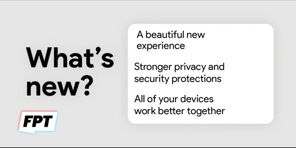
So talking about the massive redesigning it is explained in simple 3 lines as per the official slides provided:
- A beautiful new experience
- Stronger privacy and security protection
- All of your devices work better together.

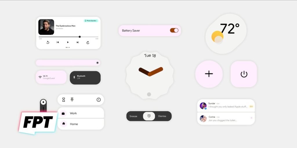
While the second slide shows little more fascinating features with major UI elements like:
- Music in Audio Player
- Brightness Slider along with new Wi-Fi and Bluetooth toggles
- Volume Slider
- In the center is the clock widget
- Snooze and dismiss alarm widget
- Weather widget with clear visual
- Brand new stacked notification bar
Now this was about the official details provided but this time Prosser has come up with an ‘Official video as a Leak which shows the following:
- The phone has quite a fluency in sliding
- Notifications at the top seem to be changed.
- Notifications revealed with more context
- The clock in the lock screen is not much bigger
- Up at the top, the notification bar is squeezed
- New keyboard
According to the above details, we can say that for the new Android 12, Google will focus heavily on the introduction of a new interface to the users, like the keyboard, app icons, and other UI elements that will match to create a consistent design across the system.
So readers, stay tuned for more and don’t forget to comment your opinions in the comment section below.

2 Comments
Pingback: Android 12’s new Privacy Dashboard could be Google's answer to Apple's privacy push - Craffic
Pingback: Android 12 Public Beta is now live: Here's Everything you Should know - Craffic