FlyQuest is a skilled esports organization based in the United States. It was founded on January 6, 2017. It is owned by Wesley Edens and Fortress Investment Group.
The team competes in the League of Legends Championship Series, it has firmly become known for its socially-focused efforts as its in-game performances. The team started various activities such as planting trees, donating to a coral reef foundation, and improving mental health. Making them one of the sweethearts of the North American LOL competitive scene.
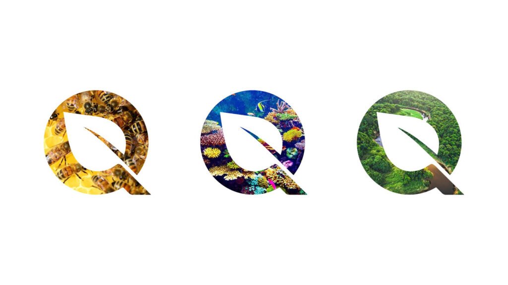
And today, FlyQuest revealed a brand-new logo, which was meant to summon its focus on everything green. It’s a clean, simple representation that reflects the organization’s goals to help the environment under its Go Green initiative and focus on the future. It’s a somewhat plain design, which comprises a straightforward “Q” with a leaf in the middle. Even after this simplicity, the rebranding has been in the works for quite some time.
“With the launch of our Go Green initiative last year, we began the hard work of defining ourselves on our own terms,” FlyQuest said in a statement. “We started with our vision: to Showcase Greatness, our company-wide philosophy that is the root of everything we do. We put in a lot of effort raising awareness and stirring real action for the environment with TreeQuest, SeaQuest, WorldQuest, and BeeQuest.”

The team started thinking about it near the end of 2019 and then spent most of 2020 and early 2021 polishing things out. The team partnered with designer Clara Nguyen to create this logo.
This has helped the team distinguish itself in an increasingly crowded field, where most esports teams center their image on competition or style. FlyQuest CEO Tricia Sugita told The Verge, “It was already a big step as an esports organization to say that this is our company vision, That’s so rare on its own.”

FlyQuest’s old logo had a lot of straight lines and hard edges, which the team wanted to avoid. The old logo did have boldness, but it was just too sharp and edgy. Despite the long process, the CEO said that the process went smoothly.
Usually, these kinds of big redesigns come as a shock to fans whether it’s in esports, traditional sports, or elsewhere. But FlyQuest’s rebranding has been much more progressive than most others. The new logo is following what could be described as a soft-launch period, which also included some various jersey designs, highlighting everything from jellyfish to honeycomb patterns.
